MYCA - Making mental health content easier to navigate.
A self-initiated redesign of a Marathi-language mental wellness app built for teachers and parents. I spotted the problem through a personal experience, defined the scope myself, and took it from audit all the way to a complete UI and design system in two weeks.
Year :
2026
Industry :
Healthcare
Project Duration :
2 weeks
Tools :
Figma, FigJam, Illustrator

01 - Background
How it started
My sister is a school teacher. One day I saw her using an app on her phone and asked out of curiosity, "What is this?" She told me it was a mental wellness app specially designed for teachers. That got me interested, so I explored it myself.
Something felt off almost immediately. The screens were busy. There was no clear place to start. The colors were loud for a mental health context. And most importantly, nothing about the experience made me feel safe or welcomed before asking me to do something. For an app where someone might be coming in during a really difficult moment, that gap felt significant enough to address.
So I decided to take it on as a self-initiated redesign. No client brief, no handed-over requirements. I defined the problem, scoped the work, and designed the solution myself.
Mental wellness apps are not like other apps. The experience itself is part of the support. If the design feels cold or confusing, you have already failed the user before they even tried to help themselves.
Mental wellness apps are not like other apps. The experience itself is part of the support. If the design feels cold or confusing, you have already failed the user before they even tried to help themselves.
02 - The Problem
What was actually going wrong
After spending time with the existing product and mapping each screen, I noticed the problems were not isolated. They were the same issue showing up in different ways across every screen.
The app was designed around its feature list, not around the person using it. Every screen opened with content and options. Nothing opened with acknowledgement. There was no "we see you" moment before "here is what you can do." For a mental health product, that order matters more than anything else.
On top of that, the visual design was working against the experience. Pink used everywhere, mixed illustration styles, no consistent spacing, and no hierarchy meant users had no idea where to look or what to do first.
When a product looks unpolished, users subconsciously trust it less. In a mental health context, that loss of trust can stop someone from seeking the help they actually need.
When a product looks unpolished, users subconsciously trust it less. In a mental health context, that loss of trust can stop someone from seeking the help they actually need.
03 - Design Questions
How might we...
Before jumping into solutions, I framed the core design questions that would guide every decision I made.
Emotional Safety
How might we make users feel safe and acknowledged before asking them to engage with sensitive content?
Clarity
How might we reduce decision fatigue so users always know where to start, regardless of their mental state?
Accessibility
How might we design an experience that works equally well for Marathi-speaking users of varying digital familiarity?
Trust
How might we communicate privacy and safety so users feel comfortable completing a self-assessment without fear of judgement?
Engagement
How might we encourage users to come back daily without adding pressure or making them feel like they are failing?
Specific Audiences
How might we design for teachers and parents who carry extra stress but may not see themselves as someone who needs mental health support?
04 - User Personas
Who I was designing for
Since this was a self initiated project with no access to real users, I built archetypes based on the two primary groups the app was clearly serving. These are grounded assumptions based on the app's content, language, and my own observation of how my sister used it.
Persona 1
Persona 1
👱🏻♀️
Sunita, 42
Senior primary school teacher, Nashik
Situation
▸ Teaches for over 15 years and emotionally supports students, parents, and junior colleagues daily
▸ Rarely thinks of her own mental health as something worth prioritising
▸ Moderate smartphone familiarity, prefers simple and predictable layouts
▸ Uses Marathi exclusively for anything personal or emotionally significant
"I give so much to everyone around me. I just need something that gives back a little, without making it a whole process."
Needs
▸ To feel seen as someone with her own needs, not just a caregiver
▸ Short, readable content she can fit into a lunch break or free period
▸ Clear time estimates so she knows what she is committing to before she starts
▸ Content that speaks to her specific stressors, not generic wellness advice
Pain Points
▸ Long content lists feel like more work on top of an already full day
▸ Buttons that do not look interactive cause confusion and hesitation
▸ Anything that feels clinical or diagnostic makes her want to close the app
Persona 2
Persona 2
👩🏻
Meera, 34
Teacher and parent, Pune
Situation
▸ Manages a classroom of 35 students during the day and comes home to a young child in the evening
▸ Constantly switching between being a professional, a parent, and a person
▸ More digitally comfortable but has very little time to explore or figure things out
▸ Often uses her phone in short bursts between responsibilities
"Between school and home, there is no time that is just mine. If this app cannot help me in five minutes, I will not use it."
Needs
▸ A starting point that is immediately obvious so she does not waste her limited time figuring out the app
▸ Activities that feel complete in 3 to 5 minutes, not open-ended
▸ Content that acknowledges she is carrying two demanding roles, not just one
▸ Something that does not feel like one more task on her already long list
Pain Points
▸ No clear primary action means she closes the app before she starts
▸ Busy layouts with no hierarchy feel overwhelming when she is already tired
▸ Generic wellness content that does not speak to her specific situation feels irrelevant
05 - User Needs
What both archetypes needed from this app
Sunita and Meera are different in their digital comfort and life situation, but their core needs from this app overlapped significantly. These became the non-negotiables that every design decision had to serve.
👀
Feel seen before being asked to act
Both Sunita and Meera spend their days taking care of others. The app needed to acknowledge that first, before presenting any options or features.
⏱️
Time clarity upfront
Meera has 5 minutes between responsibilities. Sunita has a free period. Neither has time for open-ended tasks. Every activity needed a time estimate visible before starting.
🔒
Visible privacy signals
Teachers are used to being observed and evaluated. Before a self-assessment, both archetypes needed clear reassurance that their responses were private and not shared.
📎
One obvious starting point
Sunita gets confused by layouts that do not clearly indicate what to do first. Meera does not have time to figure it out. Both needed a single, obvious action on every screen.
🌿
A calm visual environment
Both archetypes are coming to this app after stressful situations. Loud colors and cluttered layouts add to that stress. The visual language needed to do the opposite.
📖
Comfortable Marathi readability
Sunita especially prefers Marathi for anything personal. Devanagari script needs specific type and spacing treatment that the original product had not addressed.
06 - Business Angle
Why this matters beyond the user
Even though this was a self-initiated project, I approached it with a product lens. If MYCA were a real stakeholder conversation, here is how I would frame the design goals in terms of product health.
Retention
Retention
The user will not come back if the app wastes their time or if it feels like more work. The redesign introduces a mood check-in and a weekly streak that make return visits feel rewarding, not obligatory.
Feature Adoption
Feature Adoption
When every feature looks equally important and there is no starting point, users explore less. The modular card grid gives each feature equal visibility without overwhelming users, which should improve adoption across the wellness hub.
Trust and Credibility
Trust and Credibility
A mental health product lives and dies on user trust. Visual inconsistency and mixed language were actively reducing that trust. A unified design system and Marathi-first experience signal that the product takes its audience seriously.
Scalability
Scalability
Without a design system, every new screen is a new decision. That slows development and raises costs over time. The system I built means new screens inherit the visual language without extra effort from design or development.
The goal was not just a prettier app. A trustworthy, calm, and consistent experience directly supports what MYCA would care about as a product: more users who come back, more features that get used, and more teachers who actually complete the self-assessments they started.
07 - User Flow
How a teacher moves through the app
I mapped the core flow, keeping both Sunita and Meera in mind. The flow had to work for someone with 15 free minutes and for someone with 5.
01
Opens the app
Sees their name and a calming affirmation. No feature list, no choices yet. Just a moment to feel okay about being here.
Serves both Sunita and Meera
02
Checks in on how they feel
A quick mood check on the home screen. One tap, no typing. Meera can do this in 10 seconds between responsibilities. Sunita can take a moment to actually think about it.
One tap, no commitment
03
Picks something to do
The daily video recommendation gives them one clear suggestion. They can follow it or browse the wellness hub. Either way, the starting point is never ambiguous.
Clear entry point every time
04
Starts an activity or assessment
They see the privacy lock and time estimate before committing. The framing copy removes fear of judgement. They tap start only when they are ready.
No surprises, no pressure
05
Completes and gets a quiet acknowledgement
No scores, no diagnosis. Just a moment that recognises they showed up for themselves. The streak counter updates quietly in the background.
Positive, not prescriptive
06
Comes back the next day
The weekly streak and daily recommendation give a low-pressure reason to return. The habit loop is built in without demanding anything from either archetype.
Habit without pressure
08 - Design Language
Colour choices
These were not aesthetic preferences. Each choice was a direct response to something broken in the original product.
Yellow and purple together create emotional balance. Yellow brings warmth, and purple brings calm. Using soft shades of both instead of bright ones keeps the screen from feeling stimulating when the user might already be anxious. The gradient on the CTA button invites action rather than demanding it.
Purple / Lavender
#C59CFF to #765D99
Calm and thoughtful. It adds trust without feeling clinical or cold. This directly replaced the aggressive pink that was causing visual fatigue.
Yellow / Warm
#F4C12C
Warm and reassuring without being loud. Used for accents and highlights where the user needs a gentle nudge forward.
Neutral Dark
#3F3F3F to #000000
Grounds the palette and keeps it from feeling too light or unserious. Used for body text and strong hierarchy moments.
Typography choices
For typography, I chose Poppins. The rounded letterforms feel approachable and friendly rather than serious or clinical. It is easy to read in both English and Marathi, and different font weights let me build a clear hierarchy without needing to make things bigger or louder to differentiate them.

09 - Design System
Making it consistent and easy to scale
One of the clearest problems in the original product was that there was no reusable system. There were multiple card styles, different icon treatments, and random spacing patterns across screens. I built the design system in parallel with the screens so that by the end, every component was reusable and consistent.
Removed the random spacing that made the original layouts feel visually messy
A single border radius rule across all surfaces made everything feel like it belonged to the same product
The Poppins type scale was tested specifically for Marathi readability, not just assumed to work
One card component with different states replaced the six or more different card styles that existed before
The emoji mood selector, wellness feature cards, assessment cards, input fields and CTA buttons are all reusable components that any future designer on this product can use
The design system is the part of this project that will save the most time going forward. Any new screen added to MYCA now inherits consistency without anyone needing to make those decisions again from scratch.
10 - Screen Walkthroughs
Old Screens

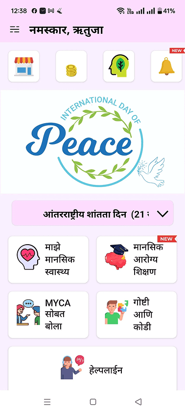


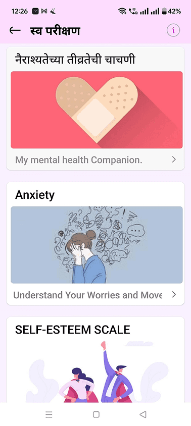
Walking through the final designs
These were not aesthetic preferences. Each choice was a direct response to something broken in the original product.
Home Dashboard

My Mental Health

Self-Assessment

07 - What I Learned
Things that stuck with me from this project
01
How a screen makes you feel is part of the product
In a mental health context, especially, emotional tone is not decoration. It is a functional part of whether the product works or not. If the screen feels wrong, the user leaves before they even try.
02
Designing for a regional language is a different skill
Working with Marathi meant thinking about type rendering, touch target sizes, and how certain idioms do not translate directly. It is not just about swapping the language. The whole layout thinking has to shift.
03
A design system early makes everything faster later
Spending time on spacing tokens and card patterns in the first week paid back heavily in the second week. The later screens came together much faster because the decisions were already made.
04
Words on screen are design decisions too
Writing "there is no judgement here" at the top of the self-assessment screen did more to reduce anxiety than any colour choice. Copy is not a content task. It is a UX decision that needs to happen in Figma, not after.
What I would do next if the project continued
Run usability sessions with actual Marathi-speaking users to check if the emotional tone and language choices land the way I intended
Track feature adoption post-launch, especially around the mood check-in and self-assessment completion rates
Build a dark mode variant since a lot of wellness app usage happens at night
Do a proper accessibility review of the Marathi typography for screen reader support
Test the emotion-first homepage approach against a more task-focused version to see whether the calming copy actually improves engagement in the data
MYCA - Making mental health content easier to navigate.
A self-initiated redesign of a Marathi-language mental wellness app built for teachers and parents. I spotted the problem through a personal experience, defined the scope myself, and took it from audit all the way to a complete UI and design system in two weeks.
Year :
2026
Industry :
Healthcare
Project Duration :
2 weeks
Tools :
Figma, FigJam, Illustrator
01 - Background
How it started
My sister is a school teacher. One day I saw her using an app on her phone and asked out of curiosity, "What is this?" She told me it was a mental wellness app specially designed for teachers. That got me interested, so I explored it myself.
Something felt off almost immediately. The screens were busy. There was no clear place to start. The colors were loud for a mental health context. And most importantly, nothing about the experience made me feel safe or welcomed before asking me to do something. For an app where someone might be coming in during a really difficult moment, that gap felt significant enough to address.
So I decided to take it on as a self-initiated redesign. No client brief, no handed-over requirements. I defined the problem, scoped the work, and designed the solution myself.
Mental wellness apps are not like other apps. The experience itself is part of the support. If the design feels cold or confusing, you have already failed the user before they even tried to help themselves.
Mental wellness apps are not like other apps. The experience itself is part of the support. If the design feels cold or confusing, you have already failed the user before they even tried to help themselves.
02 - The Problem
What was actually going wrong
After spending time with the existing product and mapping each screen, I noticed the problems were not isolated. They were the same issue showing up in different ways across every screen.
The app was designed around its feature list, not around the person using it. Every screen opened with content and options. Nothing opened with acknowledgement. There was no "we see you" moment before "here is what you can do." For a mental health product, that order matters more than anything else.
On top of that, the visual design was working against the experience. Pink used everywhere, mixed illustration styles, no consistent spacing, and no hierarchy meant users had no idea where to look or what to do first.
When a product looks unpolished, users subconsciously trust it less. In a mental health context, that loss of trust can stop someone from seeking the help they actually need.
When a product looks unpolished, users subconsciously trust it less. In a mental health context, that loss of trust can stop someone from seeking the help they actually need.
03 - Design Questions
How might we...
Before jumping into solutions, I framed the core design questions that would guide every decision I made.
Emotional Safety
How might we make users feel safe and acknowledged before asking them to engage with sensitive content?
Clarity
How might we reduce decision fatigue so users always know where to start, regardless of their mental state?
Accessibility
How might we design an experience that works equally well for Marathi-speaking users of varying digital familiarity?
Trust
How might we communicate privacy and safety so users feel comfortable completing a self-assessment without fear of judgement?
Engagement
How might we encourage users to come back daily without adding pressure or making them feel like they are failing?
Specific Audiences
How might we design for teachers and parents who carry extra stress but may not see themselves as someone who needs mental health support?
04 - User Personas
Who I was designing for
Since this was a self initiated project with no access to real users, I built archetypes based on the two primary groups the app was clearly serving. These are grounded assumptions based on the app's content, language, and my own observation of how my sister used it.
Persona 1
Persona 1
👱🏻♀️
Sunita, 42
Senior primary school teacher, Nashik
Situation
▸ Teaches for over 15 years and emotionally supports students, parents, and junior colleagues daily
▸ Rarely thinks of her own mental health as something worth prioritising
▸ Moderate smartphone familiarity, prefers simple and predictable layouts
▸ Uses Marathi exclusively for anything personal or emotionally significant
"I give so much to everyone around me. I just need something that gives back a little, without making it a whole process."
Needs
▸ To feel seen as someone with her own needs, not just a caregiver
▸ Short, readable content she can fit into a lunch break or free period
▸ Clear time estimates so she knows what she is committing to before she starts
▸ Content that speaks to her specific stressors, not generic wellness advice
Pain Points
▸ Long content lists feel like more work on top of an already full day
▸ Buttons that do not look interactive cause confusion and hesitation
▸ Anything that feels clinical or diagnostic makes her want to close the app
Persona 2
Persona 2
👩🏻
Meera, 34
Teacher and parent, Pune
Situation
▸ Manages a classroom of 35 students during the day and comes home to a young child in the evening
▸ Constantly switching between being a professional, a parent, and a person
▸ More digitally comfortable but has very little time to explore or figure things out
▸ Often uses her phone in short bursts between responsibilities
"Between school and home, there is no time that is just mine. If this app cannot help me in five minutes, I will not use it."
Needs
▸ A starting point that is immediately obvious so she does not waste her limited time figuring out the app
▸ Activities that feel complete in 3 to 5 minutes, not open-ended
▸ Content that acknowledges she is carrying two demanding roles, not just one
▸ Something that does not feel like one more task on her already long list
Pain Points
▸ No clear primary action means she closes the app before she starts
▸ Busy layouts with no hierarchy feel overwhelming when she is already tired
▸ Generic wellness content that does not speak to her specific situation feels irrelevant
05 - User Needs
What both archetypes needed from this app
Sunita and Meera are different in their digital comfort and life situation, but their core needs from this app overlapped significantly. These became the non-negotiables that every design decision had to serve.
👀
Feel seen before being asked to act
Both Sunita and Meera spend their days taking care of others. The app needed to acknowledge that first, before presenting any options or features.
⏱️
Time clarity upfront
Meera has 5 minutes between responsibilities. Sunita has a free period. Neither has time for open-ended tasks. Every activity needed a time estimate visible before starting.
🔒
Visible privacy signals
Teachers are used to being observed and evaluated. Before a self-assessment, both archetypes needed clear reassurance that their responses were private and not shared.
📎
One obvious starting point
Sunita gets confused by layouts that do not clearly indicate what to do first. Meera does not have time to figure it out. Both needed a single, obvious action on every screen.
🌿
A calm visual environment
Both archetypes are coming to this app after stressful situations. Loud colors and cluttered layouts add to that stress. The visual language needed to do the opposite.
📖
Comfortable Marathi readability
Sunita especially prefers Marathi for anything personal. Devanagari script needs specific type and spacing treatment that the original product had not addressed.
06 - Business Angle
Why this matters beyond the user
Even though this was a self-initiated project, I approached it with a product lens. If MYCA were a real stakeholder conversation, here is how I would frame the design goals in terms of product health.
Retention
Retention
The user will not come back if the app wastes their time or if it feels like more work. The redesign introduces a mood check-in and a weekly streak that make return visits feel rewarding, not obligatory.
Feature Adoption
Feature Adoption
When every feature looks equally important and there is no starting point, users explore less. The modular card grid gives each feature equal visibility without overwhelming users, which should improve adoption across the wellness hub.
Trust and Credibility
Trust and Credibility
A mental health product lives and dies on user trust. Visual inconsistency and mixed language were actively reducing that trust. A unified design system and Marathi-first experience signal that the product takes its audience seriously.
Scalability
Scalability
Without a design system, every new screen is a new decision. That slows development and raises costs over time. The system I built means new screens inherit the visual language without extra effort from design or development.
The goal was not just a prettier app. A trustworthy, calm, and consistent experience directly supports what MYCA would care about as a product: more users who come back, more features that get used, and more teachers who actually complete the self-assessments they started.
07 - User Flow
How a teacher moves through the app
I mapped the core flow, keeping both Sunita and Meera in mind. The flow had to work for someone with 15 free minutes and for someone with 5.
01
Opens the app
Sees their name and a calming affirmation. No feature list, no choices yet. Just a moment to feel okay about being here.
Serves both Sunita and Meera
02
Checks in on how they feel
A quick mood check on the home screen. One tap, no typing. Meera can do this in 10 seconds between responsibilities. Sunita can take a moment to actually think about it.
One tap, no commitment
03
Picks something to do
The daily video recommendation gives them one clear suggestion. They can follow it or browse the wellness hub. Either way, the starting point is never ambiguous.
Clear entry point every time
04
Starts an activity or assessment
They see the privacy lock and time estimate before committing. The framing copy removes fear of judgement. They tap start only when they are ready.
No surprises, no pressure
05
Completes and gets a quiet acknowledgement
No scores, no diagnosis. Just a moment that recognises they showed up for themselves. The streak counter updates quietly in the background.
Positive, not prescriptive
06
Comes back the next day
The weekly streak and daily recommendation give a low-pressure reason to return. The habit loop is built in without demanding anything from either archetype.
Habit without pressure
08 - Design Language
Colour choices
These were not aesthetic preferences. Each choice was a direct response to something broken in the original product.
Yellow and purple together create emotional balance. Yellow brings warmth, and purple brings calm. Using soft shades of both instead of bright ones keeps the screen from feeling stimulating when the user might already be anxious. The gradient on the CTA button invites action rather than demanding it.
Purple / Lavender
#C59CFF to #765D99
Calm and thoughtful. It adds trust without feeling clinical or cold. This directly replaced the aggressive pink that was causing visual fatigue.
Yellow / Warm
#F4C12C
Warm and reassuring without being loud. Used for accents and highlights where the user needs a gentle nudge forward.
Neutral Dark
#3F3F3F to #000000
Grounds the palette and keeps it from feeling too light or unserious. Used for body text and strong hierarchy moments.
Typography choices
For typography, I chose Poppins. The rounded letterforms feel approachable and friendly rather than serious or clinical. It is easy to read in both English and Marathi, and different font weights let me build a clear hierarchy without needing to make things bigger or louder to differentiate them.
09 - Design System
Making it consistent and easy to scale
One of the clearest problems in the original product was that there was no reusable system. There were multiple card styles, different icon treatments, and random spacing patterns across screens. I built the design system in parallel with the screens so that by the end, every component was reusable and consistent.
Removed the random spacing that made the original layouts feel visually messy
A single border radius rule across all surfaces made everything feel like it belonged to the same product
The Poppins type scale was tested specifically for Marathi readability, not just assumed to work
One card component with different states replaced the six or more different card styles that existed before
The emoji mood selector, wellness feature cards, assessment cards, input fields and CTA buttons are all reusable components that any future designer on this product can use
The design system is the part of this project that will save the most time going forward. Any new screen added to MYCA now inherits consistency without anyone needing to make those decisions again from scratch.
10 - Screen Walkthroughs
Old Screens
Walking through the final designs
These were not aesthetic preferences. Each choice was a direct response to something broken in the original product.
Home Dashboard
My Mental Health
Self-Assessment
07 - What I Learned
Things that stuck with me from this project
01
How a screen makes you feel is part of the product
In a mental health context, especially, emotional tone is not decoration. It is a functional part of whether the product works or not. If the screen feels wrong, the user leaves before they even try.
02
Designing for a regional language is a different skill
Working with Marathi meant thinking about type rendering, touch target sizes, and how certain idioms do not translate directly. It is not just about swapping the language. The whole layout thinking has to shift.
03
A design system early makes everything faster later
Spending time on spacing tokens and card patterns in the first week paid back heavily in the second week. The later screens came together much faster because the decisions were already made.
04
Words on screen are design decisions too
Writing "there is no judgement here" at the top of the self-assessment screen did more to reduce anxiety than any colour choice. Copy is not a content task. It is a UX decision that needs to happen in Figma, not after.
What I would do next if the project continued
Run usability sessions with actual Marathi-speaking users to check if the emotional tone and language choices land the way I intended
Track feature adoption post-launch, especially around the mood check-in and self-assessment completion rates
Build a dark mode variant since a lot of wellness app usage happens at night
Do a proper accessibility review of the Marathi typography for screen reader support
Test the emotion-first homepage approach against a more task-focused version to see whether the calming copy actually improves engagement in the data